
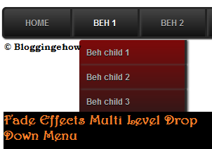
I am really excited to announce our second Blogger multi level drop down menu called "BeH-Transform".
This particular multi level drop down menu has some of the coolest fading effects. With embossed button style links, BeH-Transform can easily beat your current blogger menu design and css.
Hope you guys like it!
Lets see how to install/add it to our Blogger blogs:
Step #1 Add The Following Code
Go to Design >> Add a new Gadget and paste the following code in it.
/*BeH-Transform Multi Level Drop Down Menu*/
<style>#BeH-menu, #BeH-menu ul {
margin: 0;
padding: 0;
list-style: none;
}
#BeH-menu {
width: 600px;
margin: 60px auto;
border: 3px solid #222;
background-color: #111;
background-image: -moz-linear-gradient(#444, #111);
background-image: -webkit-gradient(linear, left top, left bottom, from(#444), to(#111));
background-image: -webkit-linear-gradient(#444, #111);
background-image: -o-linear-gradient(#444, #111);
background-image: -ms-linear-gradient(#444, #111);
background-image: linear-gradient(#444, #111);
-moz-border-radius: 6px;
-webkit-border-radius: 6px;
border-radius: 6px;
-moz-box-shadow: 0 1px 1px #777;
-webkit-box-shadow: 0 1px 1px #777;
box-shadow: 0 1px 1px #777;
}
#BeH-menu:before,
#BeH-menu:after {
content: "";
display: table;
}
#BeH-menu:after {
clear: both;
}
#BeH-menu {
zoom:1;}
#BeH-menu li {
float: left;
border-right: 3px solid #222;
-moz-box-shadow: 1px 0 0 #444;
-webkit-box-shadow: 1px 0 0 #333;
box-shadow: 2px 0 2px #444;
position: relative;
}
#BeH-menu a {
float:left;
padding: 12px 30px;
color: #aaa;
text-transform: uppercase;
font: bold 12px Arial, Helvetica;
text-decoration: none;
text-shadow: 0 1px 0 #000;
}
#BeH-menu li:hover > a {
color: #fafafa;
}
*html #BeH-menu li a:hover { /* IE6 only */
color: #fafafa;
}
#BeH-menu ul {
margin: 5px 0 0 0;
_margin: 0; /*IE6 only*/
opacity: 0;
visibility: hidden;
position: absolute;
top: 34px;
left: 0;
z-index: 9999;
background: #444;
background: -moz-linear-gradient(#700, #111);
background: -webkit-gradient(linear,left bottom,left top,color-stop(0, #111),color-stop(1, #444));
background: -webkit-linear-gradient(#444, #111);
background: -o-linear-gradient(#444, #111);
background: -ms-linear-gradient(#444, #111);
background: linear-gradient(#4444, #111);
-moz-box-shadow: 0 -1px rgba(255,255,255,.3);
-webkit-box-shadow: 0 -1px 0 rgba(255,255,255,.3);
box-shadow: 0 -1px 0 rgba(255,255,255,.3);
-moz-border-radius: 3px;
-webkit-border-radius: 3px;
border-radius: 3px;
-webkit-transition: all .2s ease-in-out;
-moz-transition: all .2s ease-in-out;
-ms-transition: all .2s ease-in-out;
-o-transition: all .2s ease-in-out;
transition: all .2s ease-in-out;
}
#BeH-menu li:hover > ul {
opacity: .96;
visibility: visible;
margin: 10;
}
#BeH-menu ul ul {
top: 0;
left: 150px;
margin: 0 0 0 20px;
_margin: 0; /*IE6 only*/
-moz-box-shadow: -1px 0 0 rgba(255,255,255,.3);
-webkit-box-shadow: -1px 0 0 rgba(255,255,255,.3);
box-shadow: -1px 0 0 rgba(255,255,255,.3);
}
#BeH-menu ul a {
padding: 10px;
width: 130px;
_height: 10px; /*IE6 only*/
display: block;
white-space: nowrap;
float: none;
text-transform: none;
}
#BeH-menu ul a:hover {
background-color: #0186ba;
background-image: -moz-linear-gradient(#04acec, #0186ba);
background-image: -webkit-gradient(linear, left top, left bottom, from(#04acec), to(#0186ba));
background-image: -webkit-linear-gradient(#04acec, #0186ba);
background-image: -o-linear-gradient(#04acec, #0186ba);
background-image: -ms-linear-gradient(#04acec, #0186ba);
background-image: linear-gradient(#04acec, #0186ba);
}
#BeH-menu ul li:first-child > a {
-moz-border-radius: 3px 3px 0 0;
-webkit-border-radius: 3px 3px 0 0;
border-radius: 3px 3px 0 0;
}
#BeH-menu ul li:first-child > a:after {
content: '';
position: fixed;
left: 40px;
top: -6px;
border-left: 6px solid transparent;
border-right: 6px solid transparent;
border-bottom: 6px solid #444;
}
#BeH-menu ul ul li:first-child a:after {
left: -6px;
top: 50%;
margin-top: -6px;
border-left: 0;
border-bottom: 6px solid transparent;
border-top: 6px solid transparent;
border-right: 6px solid #3b3b3b;
}
#BeH-menu ul li:first-child a:hover:after {
border-bottom-color: #04acec;
}
#BeH-menu ul ul li:first-child a:hover:after {
border-right-color: #0299d3;
border-bottom-color: transparent;
}
#BeH-menu ul li:last-child > a {
-moz-border-radius: 0 0 3px 3px;
-webkit-border-radius: 0 0 3px 3px;
border-radius: 0 0 3px 3px;
}
</style>
<ul id="BeH-menu">
<li><a href="https://bloggingehow.com">Home</a></li>
<li>
<a href="#">Beh 1</a>
<ul>
<li><a href="#">Beh child 1</a></li>
<li><a href="#">Beh child 2</a></li>
<li><a href="#">Beh child 3</a></li>
<li><a href="#">Beh child 4</a></li>
</ul>
</li>
<li><a href="#">Beh 2</a></li>
<li><a href="#">Beh 3</a></li>
<li><a href="#">Beh 4</a></li>
</ul>
</div>
Step #2 Time For Customization
Now simply replace these links/Anchor texts for your drop down menu. You have to replace # with your links.
NOTE: Replace https://bloggingehow.com from the Home link and add your blog's homepage URL.