Physical Address
304 North Cardinal St.
Dorchester Center, MA 02124
Physical Address
304 North Cardinal St.
Dorchester Center, MA 02124

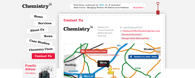
Once I get impressed with the way the author has presented himself and what he does online, I jump on to the contact us pages of all such sites and blogs. Not to really contact the guy, but just to have a feel of it. That helps me improve my strategies.
Its always good to learn from others. I have also seen many top bloggers using the About Us page as their contact us page too. How? After presenting their impressive story they give out a contact form at the end. Even some bloggers make out a new link (on that About Us page) and name it as a Contact page. The actual page is About Us. So there are many strategies that you can work on with.
Let’s see how these big guys have made out their Contact Us pages and hopefully it would give us some inspiration to work on our ours.
Well, again there is no set rule as in the About us page case. All you want is to get your point across. The main point would be the contact details but the way you would present the information is worth checking.
All these factors in fact make out a great Contact Us page (if followed correctly).
Now we start this list of top 13 best contact us pages available on the internet till today and how they looks:
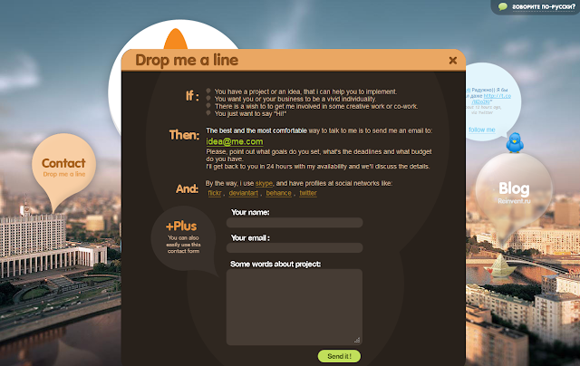
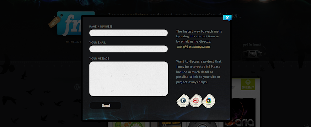
A great one I must say! Alex is a graphic designer and takes on work orders through his portfolio site. The amazing contact us form (not really a page) is no less than to give him a work order each time a visitor visits him out. The contact us form is lightbox style pop up form.
The way he presents his questions (if : this or this) you want to contact me. Nice approach.
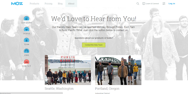
We mentioned SEOmoz in the ‘top about us pages‘ list earlier in the post and here they are again. Not extraordinary in terms of the design factor but the information and contact details are straight and to the point. They start of with this little paragraph saying:
Whether you have a question about your PRO account, need assistance using a tool, or you’re in town and want to check out the office, we want to know what’s on your mind. Our community is important to us!
A sentence or two like this really makes the visitor comfortable and pushes him towards contacting the guy. The major impact creation was done on the About us page, so here they just need to put in the contact details right away. To give out a personnel touch, they move on with adding the location on Google maps where people could find them.
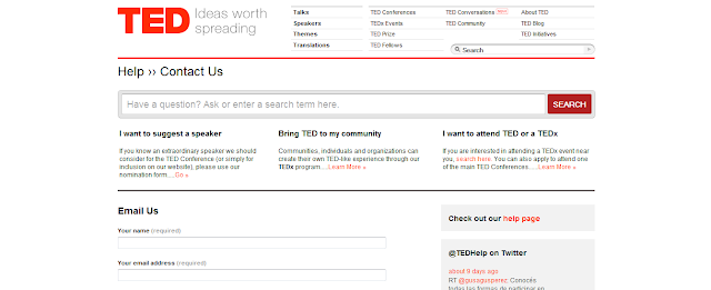
Ted has again a simple but straight forward Contact Us page. What i really like about their approach is that they ask the visitor that why really they came to the page and wanted to contact them. Like starting off,
A clean email form then gives the opportunity to contact them with any of the query mentioned above. A twitter feed is also going on in the sidebar where readers can contact them too.
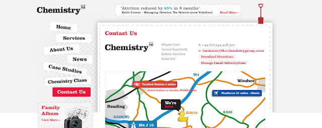
Indeed one of the great looking Contact Us pages around. The design pretty much sets it all. A simple clean looking form is placed right after the location map. Attractive Contact us page.
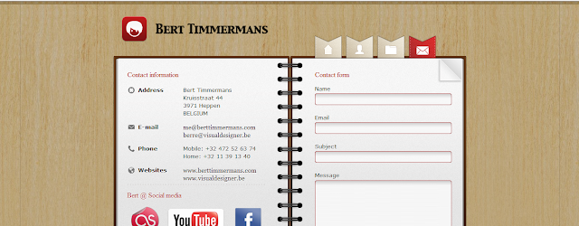
Another example of great looking Contact Us page. Its kind of a contact book style look where one page gives out the address, phone and other contact details where the next page gives out an email form. Nicely done. It doesn’t really matter if there is no text to attract the reader as that’s already been done on the About Us page. Simply make the Contact Us page look cool and the job is done.
The Copyblogger is again back in the top Contact Us page list. They tell you about their major parts (partners) and then proceed on with the contact form.
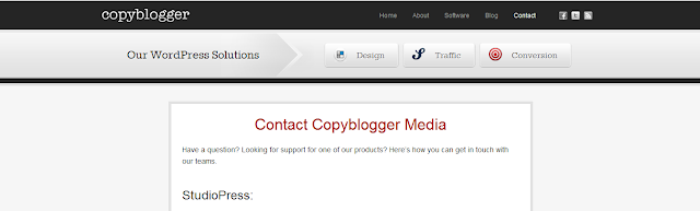
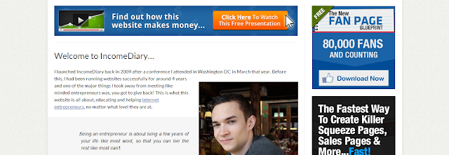
Michael Dunlop has done a great hard work with his blog over the years. He uses a different approach where he marks out a link on his About page for the contact page.
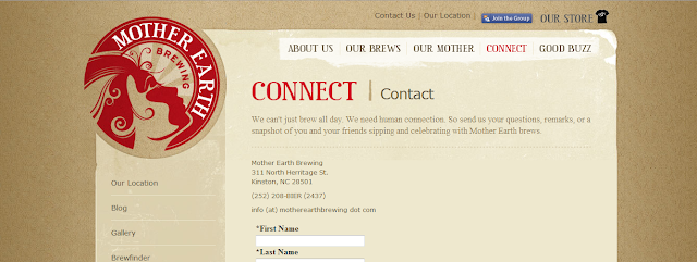
Starting off with a nice sentence:
We can’t just brew all day. We need human connection.
The contact form is simple and clean with a contact form easily accessible.
Stunning lightbox style contact form. By clicking out the ‘Get in Touch’ button, the light box appears. Lightbox style contact forms are really in.
We had a tutorial on Lightbox style Contact form that you may want to try.
Clear to the point, amazing! Every contact detail is right there, so clearly mentioned.
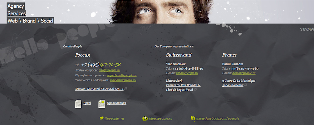
So simple! Though the contact page could have been better with some text on it but the design covers that all. The designer goes on with providing the email address plus other social media links in the sidebar.
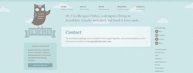
Nicely done. The simple design with easily approachable contact form is all what the reader needs from the Contact Us page.
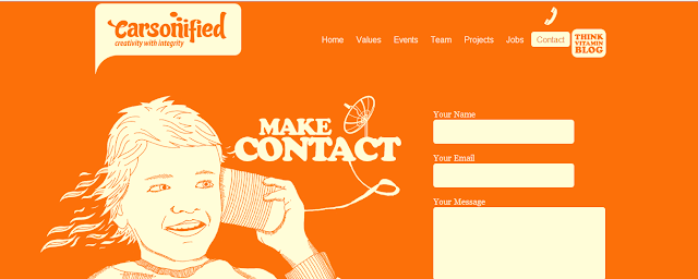
Wow! Have you seen a better contact us page design then this one. The 3D layout makes its mark into this top Contact Us page list. Well done peeps.
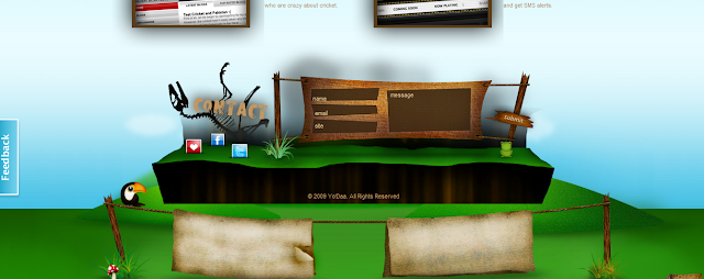
Hope you liked the Top Contact us page list. If you haven’t checked out the Top About us pages, then you are late. 🙂
Point out your favorite contact us page. Don’t just consider the looks but the purpose they are serving.
Peace!