
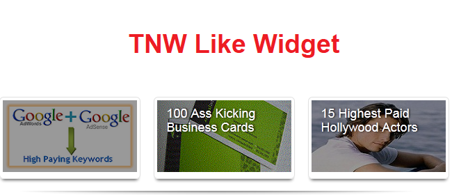
Today we have another amazing TNW 'The Next Web' style featured post widget that has been customized to give it an Apple products touch. The elegant widget is really great in terms of utilizing space and serving the purpose.
The previous widget: Blogger Featured Post Widget With Glass Shine Hover Effect was though a top-class thing, but the downside was the space it requires for simply 3 featured posts.
We could edit this 'The Next Web' featured post widget to add up 3 more posts, and that would take up the same space.
Looking forward to that, we are going to share this great widget with you guys.
Step #1 Customize the widget code
Copy below coding:
<div id="top-stories-home" class="mb-2" data-vr-zone="Photo Features">
<ul id="topstories" class="clearfix">
<li data-vr-contentbox="">
<div class="shadow">
<a class="frame" href="First Post Link">
<img class="attachment-top_stories_site wp-post-image" width="193" height="103" src="First Post Image Link ">
</a>
</div>
<div class="media-data">
<a class="title" href="First Post Link">First Post Title</a>
</div>
</li>
<li data-vr-contentbox="">
<div class="shadow">
<a class="frame" href="Second Post link">
<img class="attachment-top_stories_site wp-post-image" width="193" height="103" src="Second Post Image Link">
</a>
</div>
<div class="media-data">
<a class="title" href="Second post Link">Second Post Title</a>
</div>
</li>
<li class="last-child" data-vr-contentbox="">
<div class="shadow">
<a class="frame" href="Third Post Link">
<img class="attachment-top_stories_site wp-post-image" width="193" height="103" src="Third Post Image Link">
</a>
<span class="last-child" style=" line-height:0px; font-size:8px; font-weight:bold; margin-left:180px;
"><a style="color:#D3D3D3;" href="https://bloggingehow.com">Blogger Widgets</a></span>
</div>
<div class="media-data">
<a class="title" href="Third Post Link">Third Post Title</a>
</div>
</li>
</ul>
</div>
<style>
#topstories {
margin: 0;
padding: 0;
}
#topstories li {
display: inline-block;
float: left;
margin: 0 22px 0 0;
position: relative;
width: 200px;
}
#topstories li.last-child {
border-left: medium none;
margin-right: 0;
}
#topstories .frame {
border-radius: 6px 6px 6px 6px;
box-shadow: 0 5px 4px -4px rgba(0, 0, 0, 0.8);
padding: 4px;
}
#topstories .shadow {
background: none repeat scroll left bottom transparent;
padding-bottom: 7px;
}
#topstories .shadow img {
max-height: 103px;
max-width: 193px;
}
#topstories .media-data {
-moz-transition: background 0.3s ease-in 0s;
background: none repeat scroll 0 0 rgba(0, 0, 0, 0.4);
left: 5px;
position: absolute;
top: 5px;
}
#topstories .media-data:hover {
background: none repeat scroll 0 0 transparent;
}
#topstories .media-data .title {
color: #FFFFFF;
display: block;
font-size: 18px;
height: 85px;
overflow: hidden;
padding: 9px 14px;
text-shadow: 1px 0 2px black;
width: 165px;
}
#topstories .media-data .title:hover {
text-decoration: none;
}
#top-stories-article {
margin-bottom: 22px;
}
#top-stories-article #topstories {
padding-left: 15px;
}
#top-stories-article #topstories li {
border-right: 1px solid #EBEBEB;
font-size: 11px;
height: 80px;
overflow: hidden;
padding-right: 15px;
width: 290px;
}
#top-stories-article #topstories li:last-child {
border-right: 0 none;
padding-right: 0;
}
#top-stories-article #topstories li.last-child {
border-right: 0 none;
padding-right: 0;
}
#top-stories-article .shadow {
background-position: right bottom;
padding-bottom: 0;
}
#top-stories-article .shadow img {
border-radius: 6px 6px 6px 6px;
max-height: 122px;
max-width: 280px;
}
#top-stories-article .shadow .frame {
border: 0 none;
box-shadow: none;
height: 80px;
overflow: hidden;
padding: 0;
width: 280px;
}
#top-stories-article .media-data {
border-radius: 6px 6px 6px 6px;
left: 0;
top: 0;
}
#top-stories-article .media-data .title {
height: 62px;
width: 252px;
}
a {
text-decoration: none;
}
#topstories .frame {
border-radius: 6px 6px 6px 6px;
box-shadow: 0 5px 4px -4px rgba(0, 0, 0, 0.8);
padding: 4px;
}
.frame, .post img {
background: none repeat scroll 0 0 #FFFFFF;
border: 1px solid #E0E0E0;
box-shadow: 0 5px 5px -5px rgba(0, 0, 0, 0.8);
display: inline-block;
padding: 3px;
}
</style>
Customize the code above by editing those bolded texts as to what they point to.
For example you need to place your first article link where First post link is mentioned.
NOTE: And make sure that your images are of dimensions 190x103 px.
Step #2 Place the widget on your blog
Navigate to your Blogger Dashboard >> Layout >> Add a gadget >> HTML/JavaScript. Paste the customized code with in it and hit save. All done folkes!
Need Help?
In case you need any help customizing the widget, leave out a comment below and I would love to get back to you.