
Finally here we have one of the amazing tweaked widget that we ever shared before.
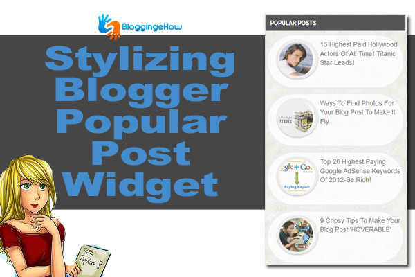
After customizing Blogger's official popular post widget for hours and testing out different CSS3 stylize, we now have fully customized/stylized Bloggers default popular post widget that features an elegant bordering with image circular image hover effects.
I am sure you guys would like the widget as much as I did customize it. Have a look at it below.
You can test out the widget live on our sidebar too.

There are multiple hover effects applied to the popular post widget image that brings a whole new life to the widget.
Now simply follow the steps below to customize your blogger blogs popular post widget.

Step #1 Open Edit HTML
Go to Blogger Dashboard >> Template >> Edit HTML and backup your template.
Once done find the following code below:
]]</b:skin>
Once you find it, follow the next step,
Step #2 Add the code
Now we'll override the default popular post widget code (override it) with our own new style.
Paste the following code just above the code you found in step #1
/*--- BeH Popular Posts Widget Customized--- */
.popular-posts .item-thumbnail img:hover {
opacity: 1;
/*Reflection*/
-webkit-box-reflect: below 0px -webkit-gradient(linear, left top, left bottom, from(transparent), color-stop(.7, transparent), to(rgba(0,0,0,0.4)));
/*Glow*/
-webkit-box-shadow: 0px 0px 20px rgba(255,255,255,0.8);
-moz-box-shadow: 0px 0px 20px rgba(255,255,255,0.8);
box-shadow: 0px 0px 20px rgba(255,255,255,0.8);
-webkit-transform: rotate(-7deg);
-moz-transform: rotate(-7deg);
-o-transform: rotate(-7deg);
}
.popular-posts .item-thumbnail img {
border-radius: 100px 100px 100px 100px;
box-shadow: 0 1px 3px rgba(0, 0, 0, 0.4);
border: 5px solid #eee;
/*Transition*/
-webkit-transition: all 0.5s ease;
-moz-transition: all 0.5s ease;
-o-transition: all 0.5s ease;
}
.popular-posts ul li {
margin: 12px;
opacity: 0.8;
border: 5px solid #eee;
border-radius: 100px 100px 100px 100px;
/*Transition*/
-webkit-transition: all 0.5s ease;
-moz-transition: all 0.5s ease;
-o-transition: all 0.5s ease;
/*Reflection*/
}
.popular-posts a{
font-size: 13px solid;
}
Help Desk
That's all! I really hoped that you guys liked the effort.
I would love to hear from you above the customization in the comment section below.
And yea, do give it a 'like' 🙂